Re-viz-iting the Receipt
This blog post is also published through the Data Visualization Society's Medium publication, where you can find pieces on historical data visualization and data humanism
When you start learning about a field, you are inspired just by gathering your fundamentals, building your skills, and trying out anything you can get your hands on.
But now, having spent many years doing just that, I asked myself: what type of data visualization project would I love to see or read more about? Knowing what I know now, what project would I find inspiring? Instead of continuing to explore deeper into a field becoming more and more specialized, I felt the most refreshing experiment would be to step outside, take a look around, and find new ways of applying the knowledge and skills I’ve already accumulated.
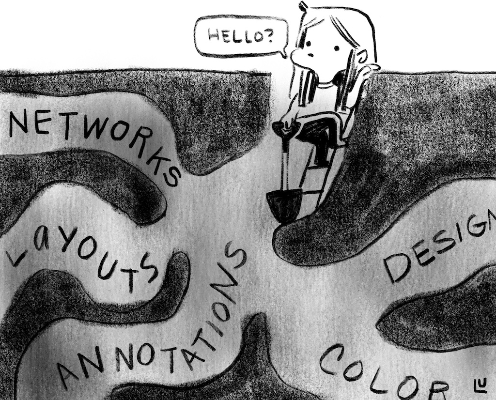
The more I’ve learned, the more the importance of data visualization's applicability and value has grown for me. Data visualization shouldn't be a niche field. It’s information design, it’s design, it’s communication--and given that lens its application can be both broad and impactful.
With this in mind, I brainstormed ideas for projects, and was particularly compelled by thinking of ways that data visualization could be used to redesign everyday experiences. I wanted to find commonplace data that we take for granted or perhaps ignore completely. After thinking about objects we see but rarely engage with, the idea I was most excited to start exploring was a remake of the receipt.
Two goals I thought were applicable to a redesign:
- Highlight the cost of each item in an easy to scan design (right now each item takes up the same space regardless of cost)
- Inspire and provoke the audience to question "Why couldn’t everyday objects like receipts use data visualization?"
The Design
I started by taking a recent grocery receipt and constrained myself to use only the price data and categories. The categories I added myself -- this was metadata I found on another grocery receipt example I had from a neighboring grocery store.
Working with the thermal printer added several physical constraints:
- The one I used was even smaller in width than the original receipt.
- I could only use black and white.
- Through test prints I found it couldn’t print solid horizontal lines, so I had to work with patterns.
Here is the final design for this exploration:
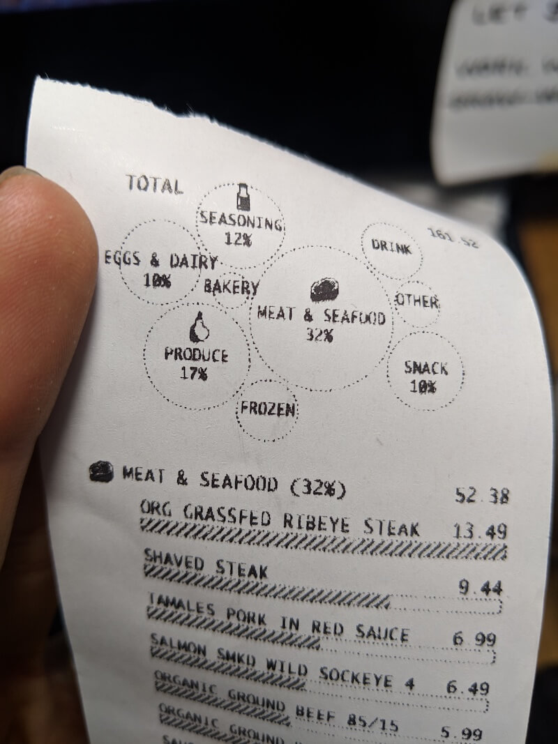
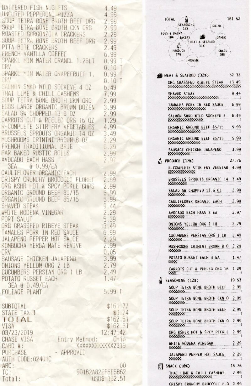
At the top I've summarized the categories into a bubble chart. I wanted to pick a visualization that separated itself visually from the bar charts below and didn't take up too much space. Bubble charts aren't the most effective for precise comparison, but they can give a good approximation of similar sized items and rank. In this case, Meat & Seafood and Produce stand out as the top two categories, with Seasoning and Eggs & Dairy trailing after.
I added two affordances to enhance comparison and compensate for the more difficult comparison of circle sizes: All the larger bubbles have the percentage labeled and the largest bubbles also include icons. I decided to include icons partially so you could relate the summary section and the list area but mostly because I found the icons fun (remember fun??).
For the list of items, I:
- Grouped them by their respective categories
- Gave category summaries by total price and percent of the bill
- Ordered the categories based on the most expensive item
So in this case the ORG GRASSFED RIBEYE STEAK was the most expensive item on the receipt, and so MEAT & SEAFOOD is the first category shown. With the horizontal size limitations in mind, in the bar charts below each label I decided to use the most expensive item to represent a full bar at maximum width. This allowed me to use the same axis across items for easy comparison, without making the bars for lower priced items so tiny that it became difficult to see. Had the bars represented a percentage of the total bill this visibility would have presented an issue.
The Process
These are the steps I took to create the receipt:
- Prototyped the visualization designs using D3 in SVG
- Took a screenshot of the SVG
- Turned it into black and white using a threshold image filter. This removed any grey pixels that were created through antialiasing
- Uploaded the black and white image to onto an HTML canvas layer set up with the thermal print driver
- Printed the design
This was made easier using a driver ported over by Sam Saccone to JavaScript that allows you to connect a thermal printer to your computer via USB, and through the web USB API send images for printing.
The Reception
I tweeted photos about this project, and the project took off receiving over 7.5k likes on Twitter, was on the home page of Hacker News, and had an article written up about it by Fast Company.
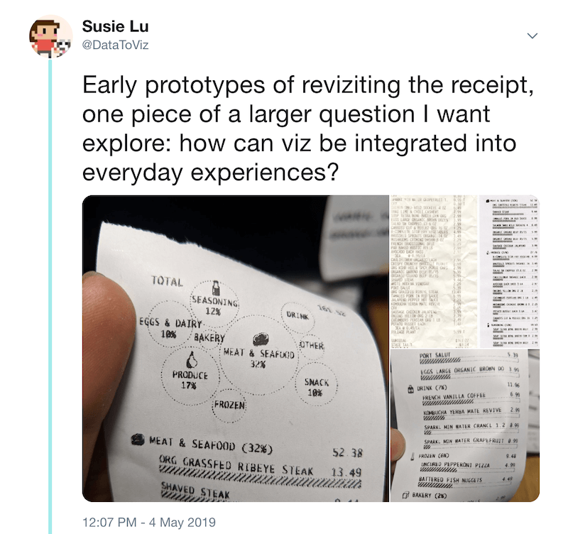
Feedback on the project (primarily via Twitter comments) ranged from very negative to very positive.
Some Critiques:
- This design would use more paper
- Receipts are harmful to the environment because of BPA
- They wanted digital receipts, #longlivetheqrcode
- Didn’t understand the bar charts
- Bubble chart readability
- Larger font size for accessibility
- Larger font size for total price
Some Praise:
- Innovative, futuristic, general excitement, and awe
- Made them think about an everyday object that they had never imagined could be remade
- Engagement with the viz
- Large audience base liked and retweeted this project
- Several payment system companies notices the project and reached out
- The best compliment: that seems so obvious, why wasn’t it done before
- Favorite quote from the Fast company article: the final result is fantastic. It’s clear, helpful, and a bit quirky–a perfect trio that would make it a valuable design for any big grocer trying to humanize its customer service a bit.
The overwhelming interaction and reception of this project was shocking to me. I’ve never had so many people outside of data visualization and programming interact with a project that I've made. The feedback, especially the critique, highlighted areas that could further improve this experiment for anyone interested in turning this idea into a full prototype.
In particular I thought larger font sizes for the total price was a great note, as that value should stand out more as you scan the receipt. I also understood the confusion about the bar charts and agree there needs to be a label explaining the scale is based on the most expensive item. Finally, while I agree that a digital version of the receipt might allow for some extra visualization or the possibility of viewing trends over time, my goal was to limit the concept to the same presentation and data as the original design. I didn’t want a different type of technology to make the concept feel out of reach. Remaking the receipt on an actual receipt with the same kind of printer greatly reduces the reasons for a “Why not / That’s impossible” response and limits the scope to a design problem versus a technological one. In addition, as a rebuttal to going fully digital, one responder also importantly noted that paper receipts are more accessible to low income families.
I don’t have any plans to take this idea further on my own or with any of the companies that reached out, but I would love to see them take this inspiration and move forward. The response and engagement with the idea has far exceeded my expectations, and my next plans are to play with other everyday objects that could also benefit from a data visualization makeover.
Thanks to Alyssa Bell and Elijah Meeks for editing.