Farmers Markets
A series of data visualizations on Farmers' Market data from data.gov.
Dataset Properties
- Name
- Location (lat, long, city, state, address)
- Hours of operation
- Different goods categories and a yes/no if they're available at that market
Understanding the dataset
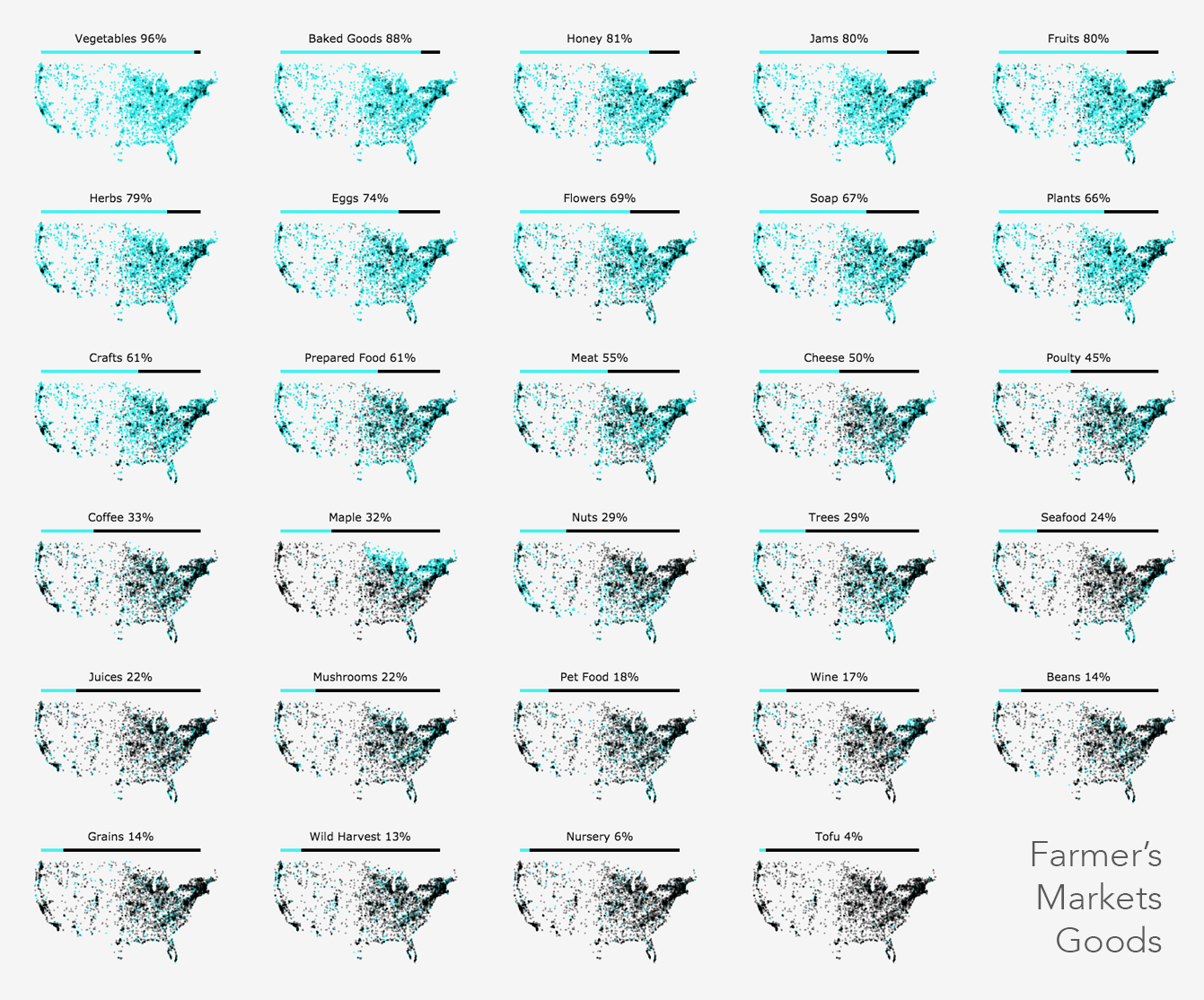
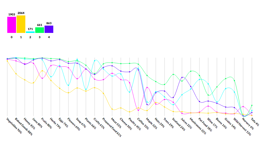
I made the following graphic to understand the distribution of the 29 goods for each farmers market such as availability of honey, flowers, fruits, wine, etc. After filtering out some results that didn't have attributes I was interested in, there were roughly 5.5k farmers markets left.
I was surprised to see how correlated location was with maple availability and that there are more farmers markets with baked goods, honey, and jam, than there are with fruits. Also fascinating to see that 18% of markets sell pet food.
Play time
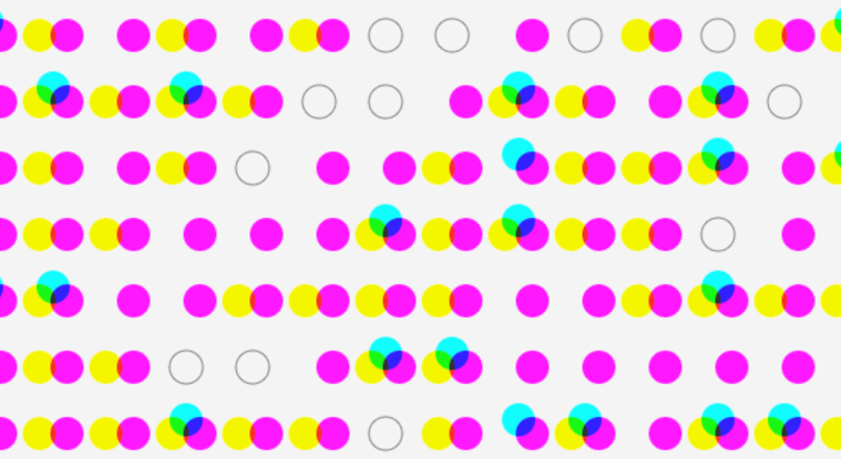
A fun abstract example where each farmers market is represented by a series of circles depending on if it had juice (cyan), cheese (yellow), baked goods (magenta), or an empty circle if it didn't have any of those goods.
Animating jus cuz.
Bump Overlap
The next version was to look at two different dimensions for the farmers markets and understand how the dimensions overlapped. I explored this with a bump chart that encoded the overlap as well as changed rank.
In this case you can see how seafood dominates the farmers markets on the west coast but then as you get into the midwest maple starts to take over and then dominates for most of the eastern side of the US. The interactive version allows you to pick which goods you're comparing.
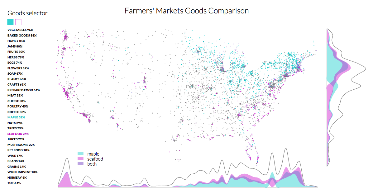
See the interactive version on bl.ocks.
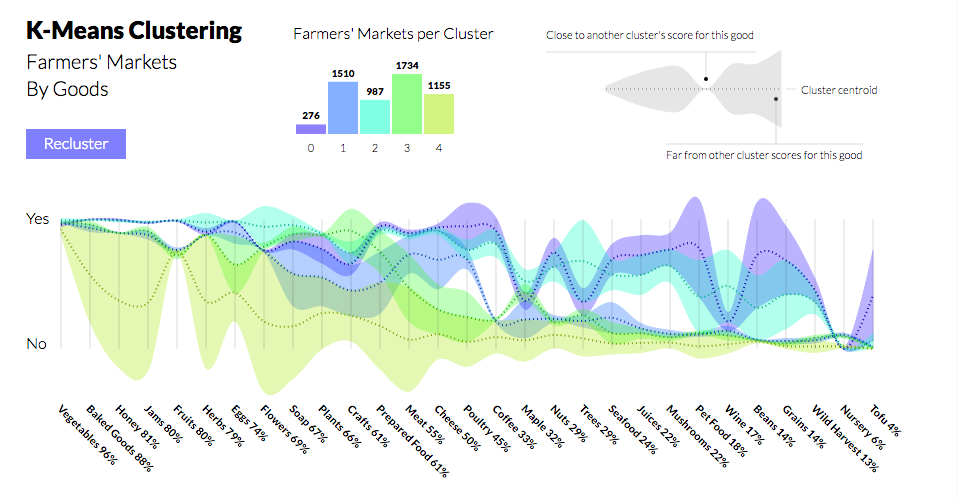
K-Means Clustering
This iteration was spurred by Elijah suggesting k-means clustering on the dataset. Thanks @emilbays for the kMeans Library.
The first pass was to understand when clustered, how did each cluster's centroid fall from 0 (No) to 1 (Yes) on the scale for each dimension.
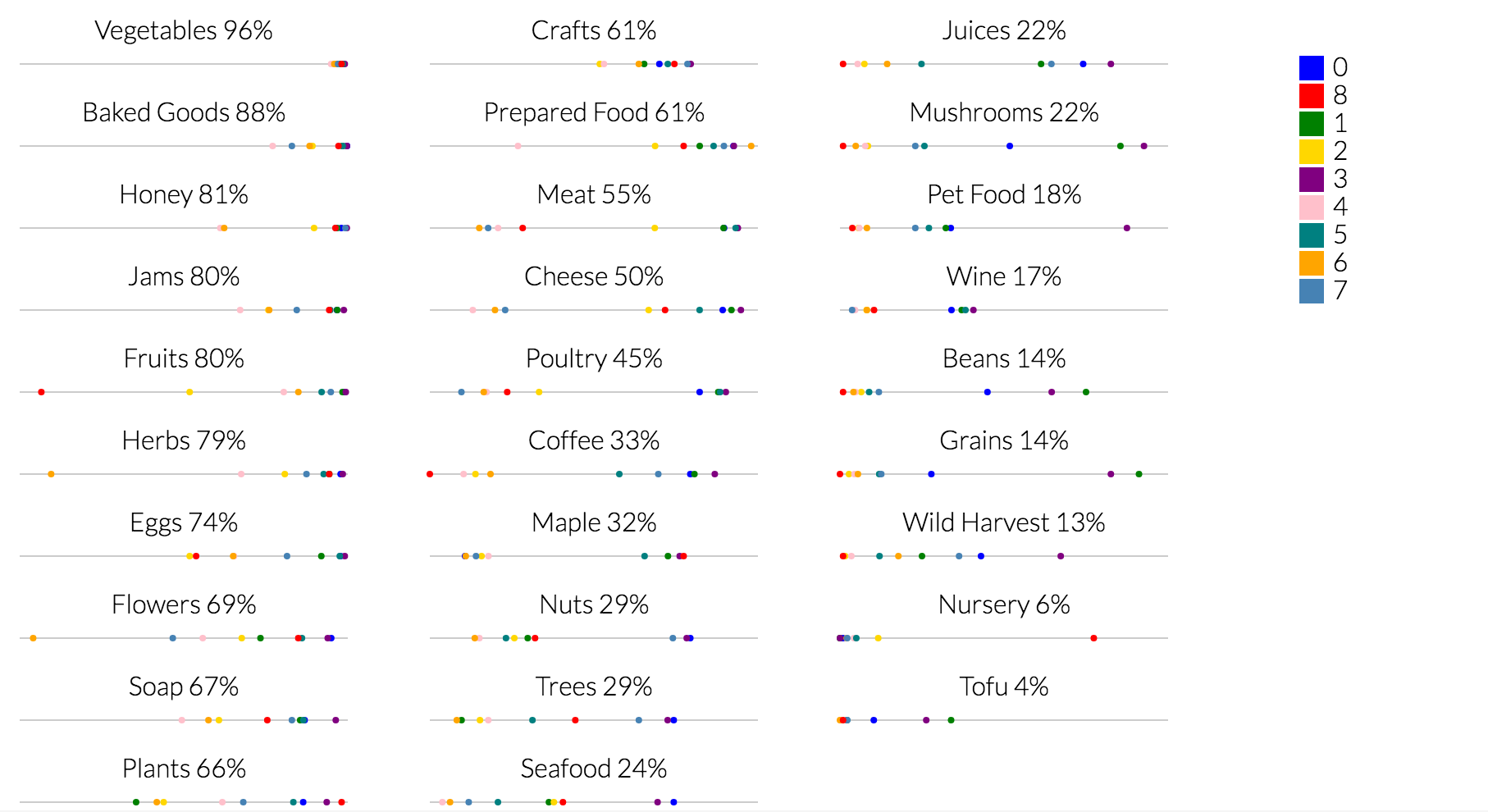
I decided it would be more interesting to show those distributions connected in a series. The x-axis is organized from most common to least common goods.
The biggest change in the final version was the addition of areas around the lines representing each cluster's centroid values. The areas exaggerate that cluster when it deviates from the rest of the clusters. This attempts to visually answer the question "Which features in each cluster differentiate it from the rest?"
Creating the legend for this made me realize how much even a simple annotations framework would make it so much easier to create callouts and annotations for your visualizations. Sounds like my next project :)
See the interactive version on bl.locks.