Abstractions
Part 1 of 3 from my Data Visualization Retrospective talk at Visfest 2019
This part describes the role of abstractions, and the importance of creating landmarks between layers of abstraction in data visualization.
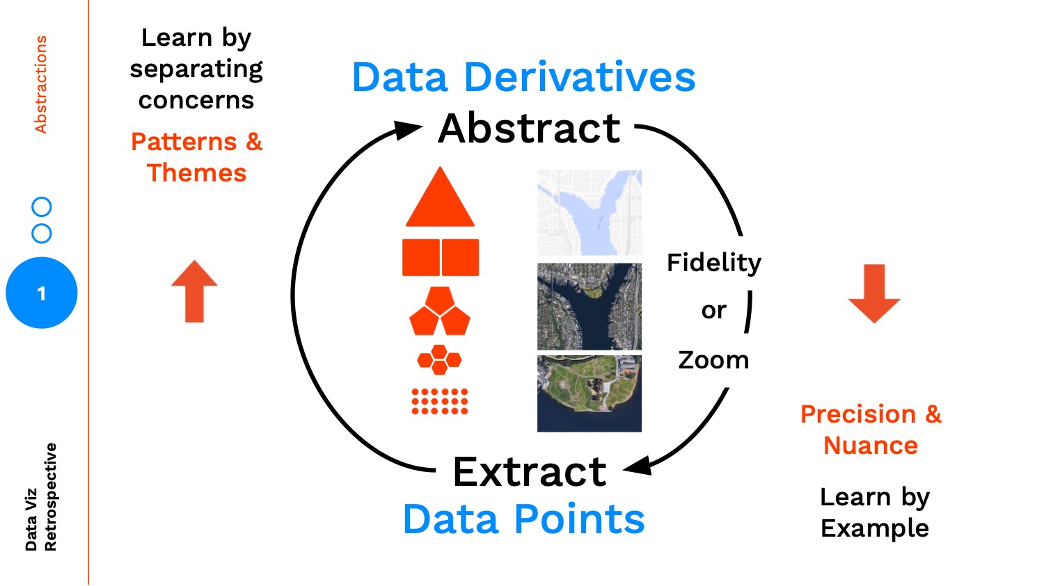
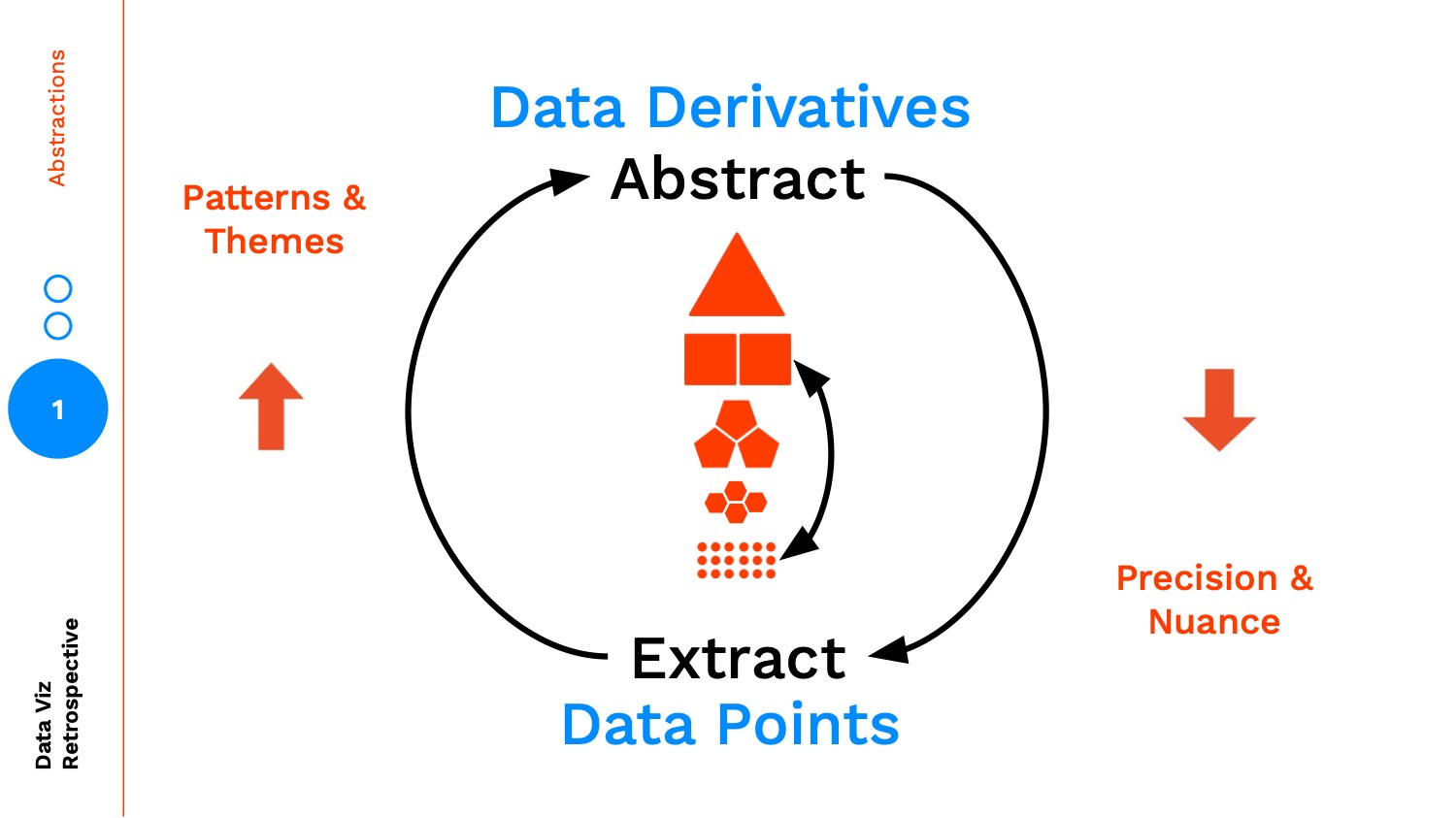
Data Points and Data Derivatives
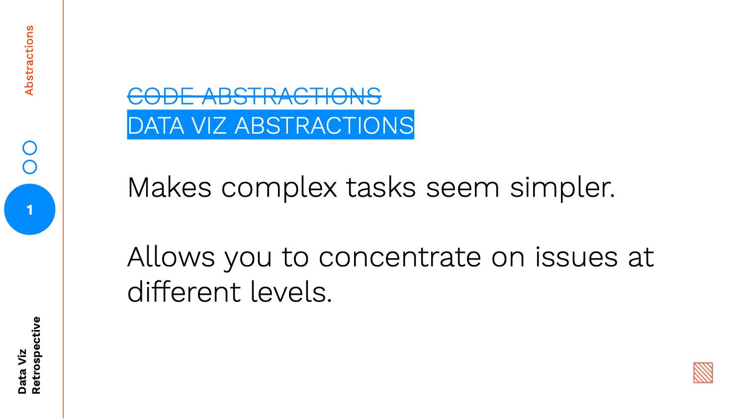
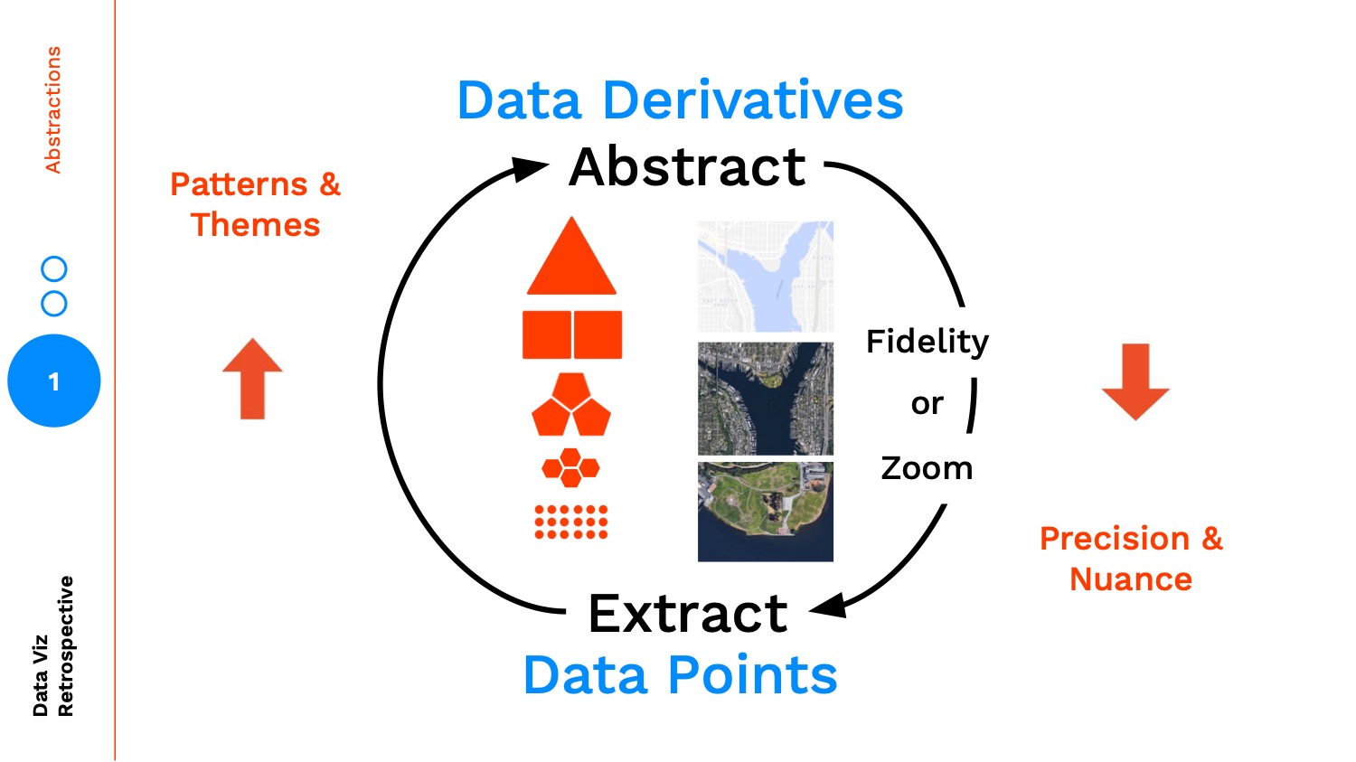
In data visualization design we often create views into the data at multiple layers of abstraction. Why do this? For those of you that are programmers, we're faced with making code abstractions because:
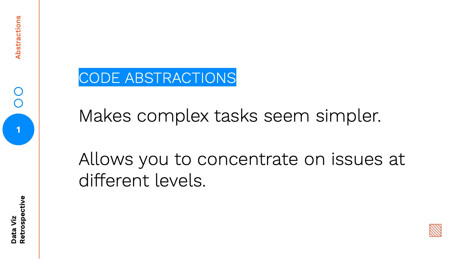
The same reasoning applies to creating data visualization abstractions:
As we abstract higher and higher we are finding insights through patterns / themes and learning by separating concerns, conversely as we make our way down to the data points, we are understanding the precision and nuance in our data through learning by example.
Pokémon Case Study
Let's jump into an example. When I was a kid, I absolutely loved playing the original Pokémon games. I even owned the guidebook that walks you through all of the levels, shows you where items are located, and generally provides detailed information on all aspects of the game.
Here are two scans from the guidebook:
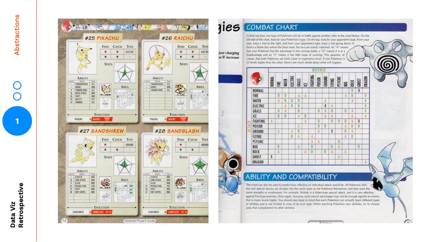
The left shows a section detailing each individual Pokémon. You can see its stats displayed as a radar plot, the moves it learns at different levels, and a map of where it can be found. As part of the game you catch these Pokémon, train them, and battle other trainers. Each Pokémon can either be of a single type (i.e. Water, Fire, Ground), or a combo of two types. In the battles there are advantages and disadvantages between the types. The image on the right summarizes those advantages and disadvantages.
In the images above, the individual Pokémon cards are the data points, and the summary of types is a level of abstraction. Last year, I decided to revisit this dataset. I started by creating a view at the Pokémon types level:
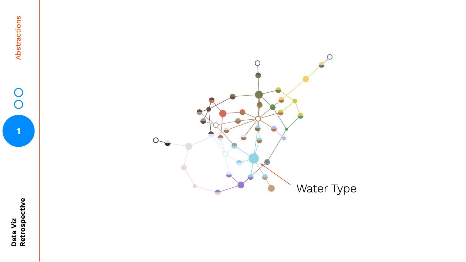
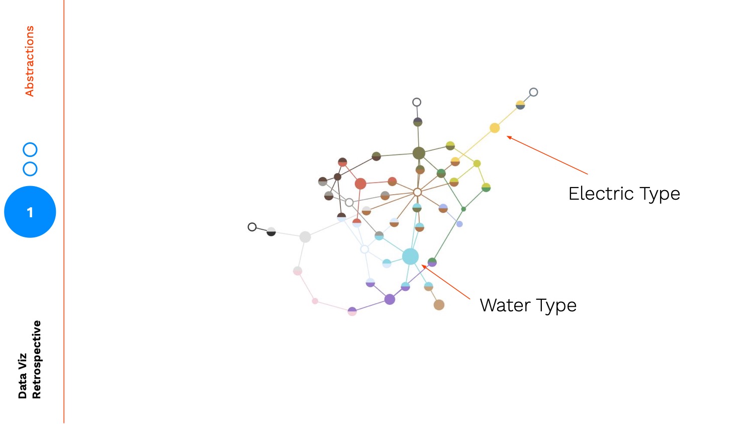
In this visualization, the types are connected by Pokémon that are split between types. For example: the Water type is connected to the Fighting type because there is a Pokémon that is of both Water and Fighting types.
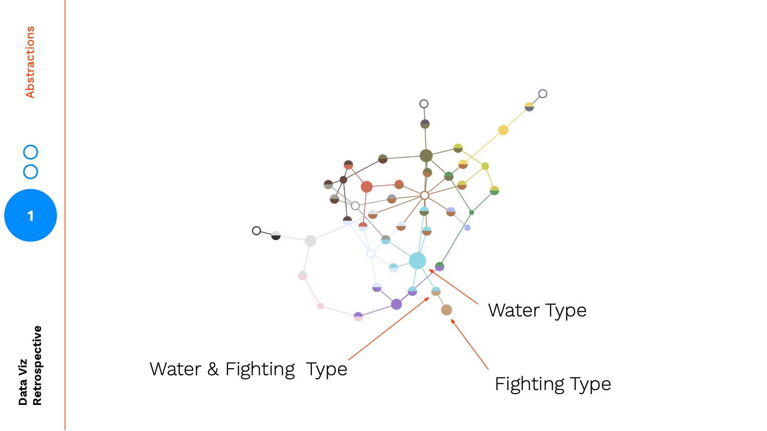
A counter example: Water and Electric are very far away because there are no Pokémon with shared types that link Water and Electric directly.
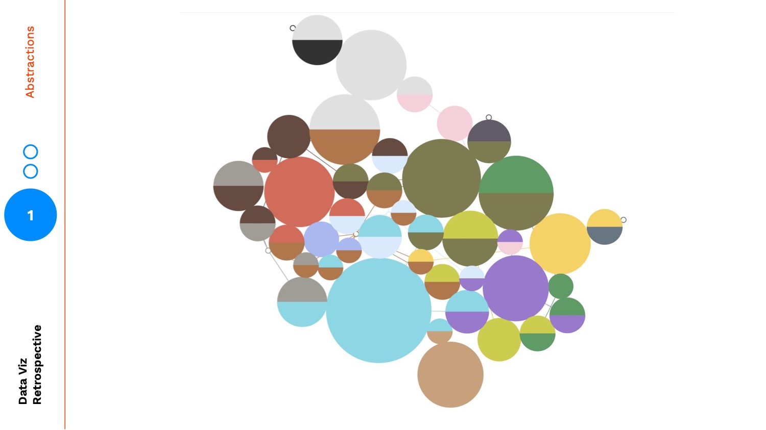
Here is a version where I sized each of the circles by the number of Pokémon in each type:
And this is the final version, where actual sprites of the Pokémon themselves have been added to each circle:
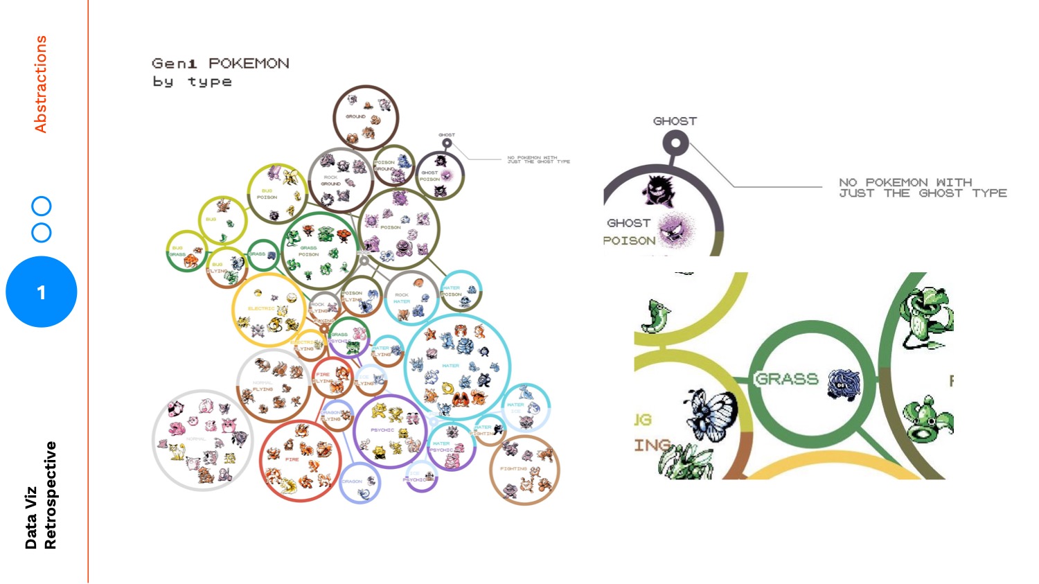
It wasn't until this final version that the design clicked for me. It allowed me to gather more tangible insights. For example there are no Pokémon that are just the Ghost type. All Ghost types are combinations with other types. Another interesting feature: Tangela is the only Grass type Pokémon.
The key takeaway here is the value in creating successful designs that allow readers to travel between different levels of abstraction. The final version provides access to the aggregated types and a meaningful way to connect that aggregation back down to data points, the Pokémon themselves.
Maps and Landmarks
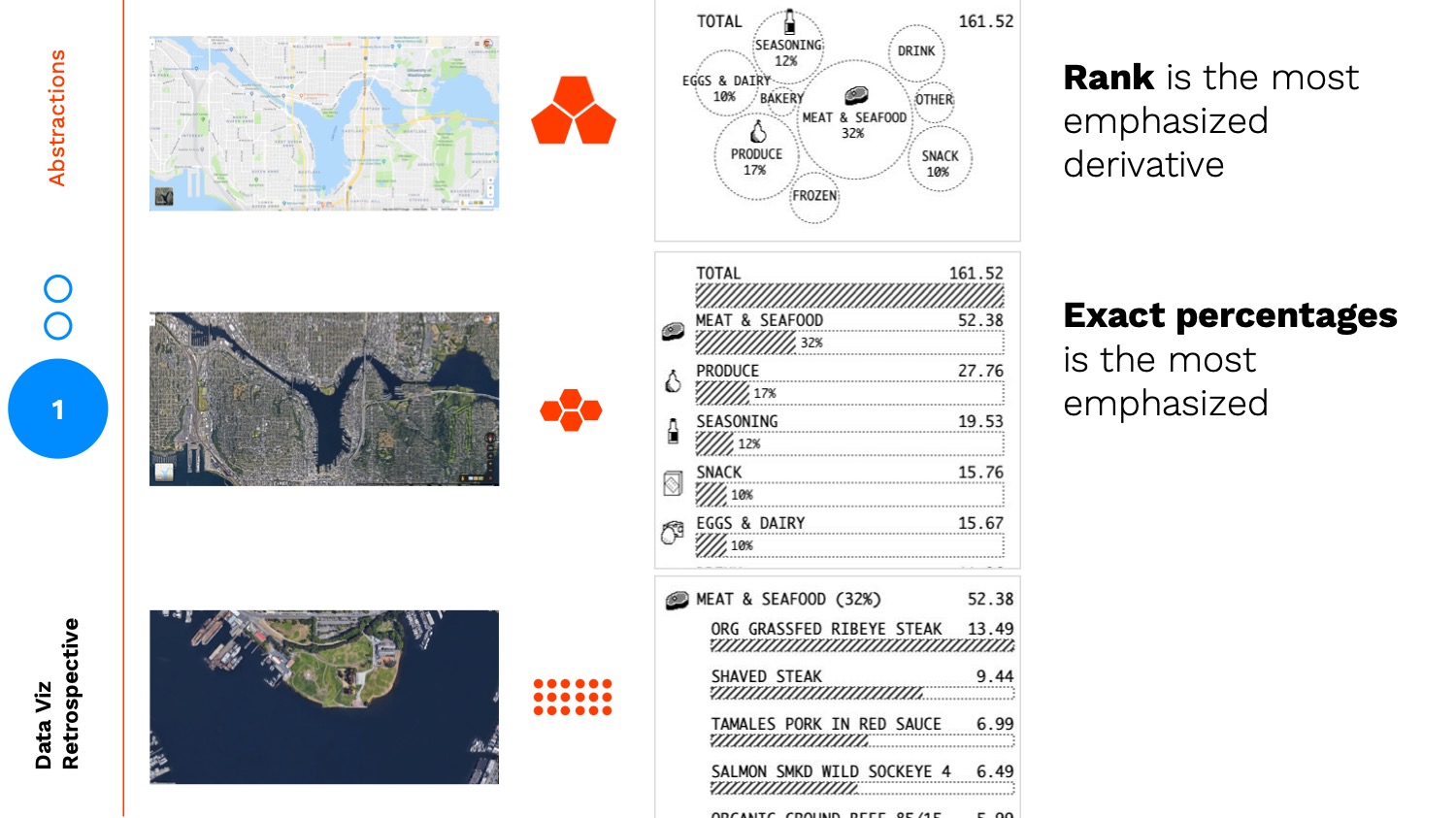
The biggest pitfall when creating levels of abstraction is to limit your thinking by assuming abstractions only exist across one axis. A common abstraction is aggregation as shown in the Pokémon example. To illustrate two different abstraction axes (I'm sure there are more), let's think about these different levels of abstractions as maps:

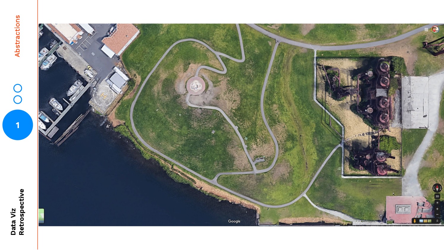
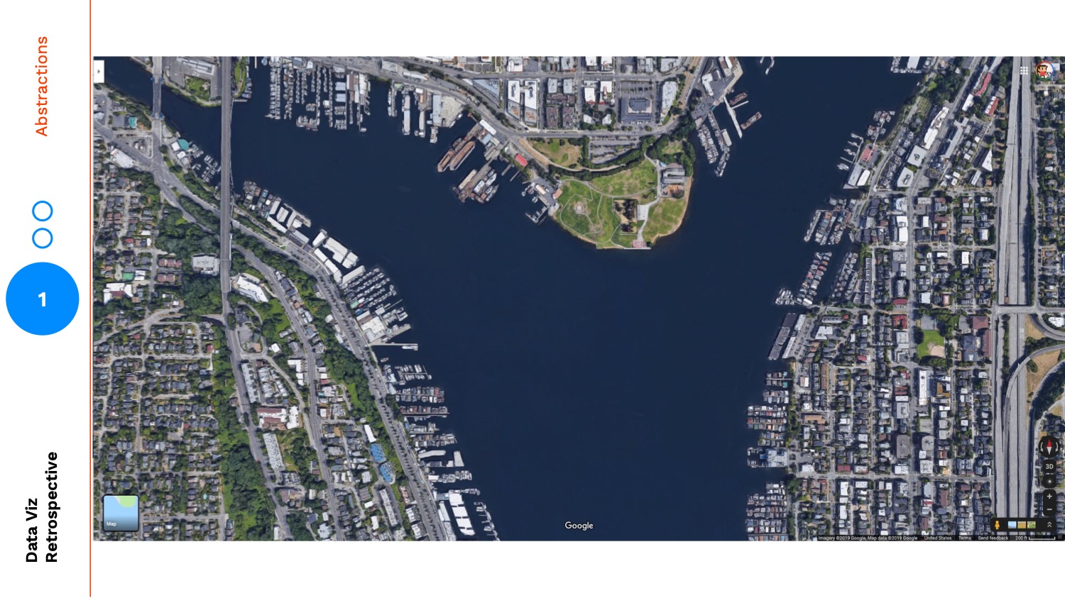
As I look at this very zoomed in image of Gasworks Park, my eye is drawn to the shape of the meandering paths and how many boats are docked:
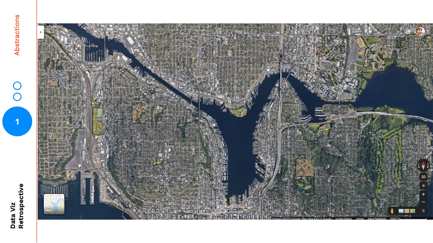
But as I zoom out, my perspective changes:
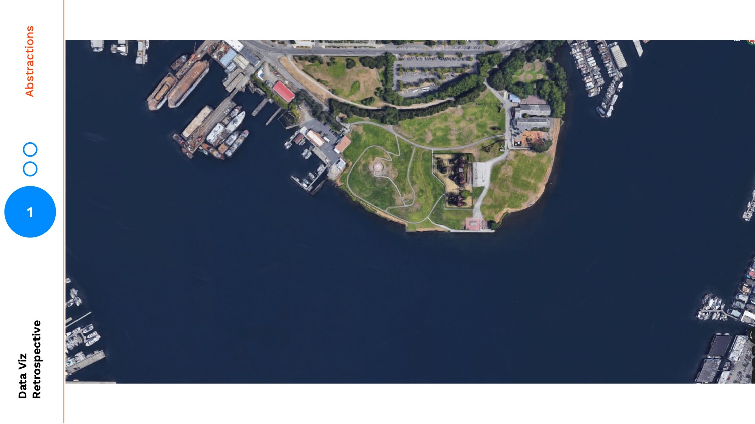
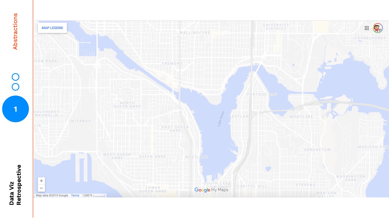
In the most zoomed out version, my mind shifts to focus on the cutout between land and water, the ratio of green space to residential. This zooming is a metaphor for aggregation:
Zooming is one form of abstraction, perhaps the de facto form we think of, but we can also use visual abstraction to further bring our audience into higher levels. For example, the map below is at the same zoom-level but the level of visual abstraction is much higher. It has a lower fidelity:

Again my mind completely shifts focus. In this version my attention is no longer wasted on the granular details of a satellite image, it's now only allowed to examine the solid cutouts between land and water, the neighborhood names, and the highways and roads.
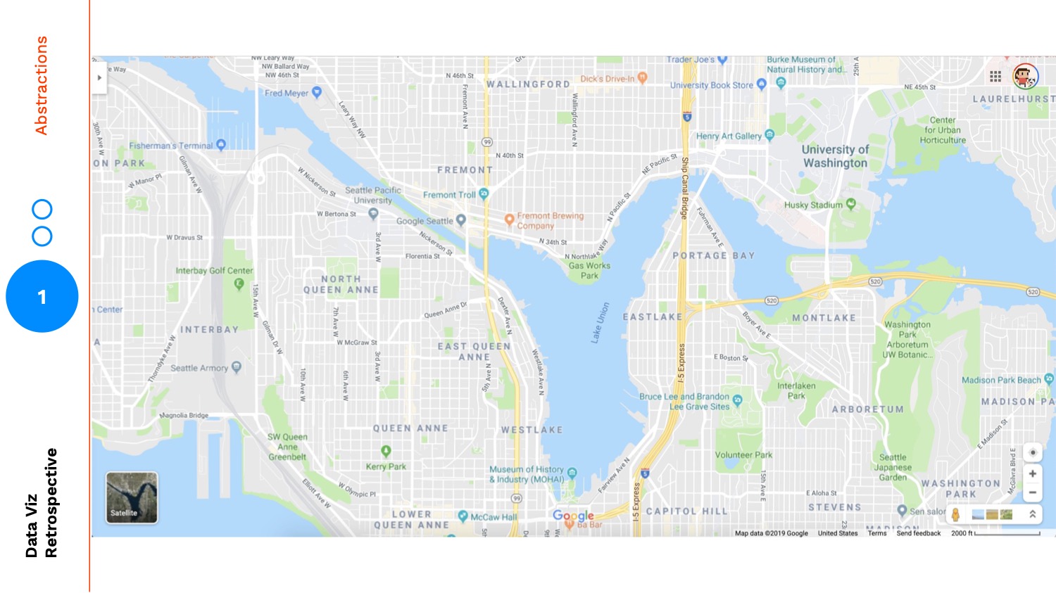
But, neither of these views are what we see when we open up Google Maps. When we open up Google Maps we see this:

This view provides some layers of the satellite map and some layers of the cutout map. It also adds in a layer to travel between: landmarks.
The most popular roads are labelled, as well as individual sites that I could be familiar with. So, even though this is a more abstracted version through using zoom and visual fidelity, the landmarks make it easier for me to orient myself and find a specific location.
Receipts Use Case
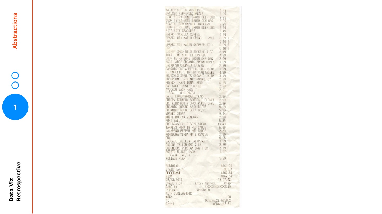
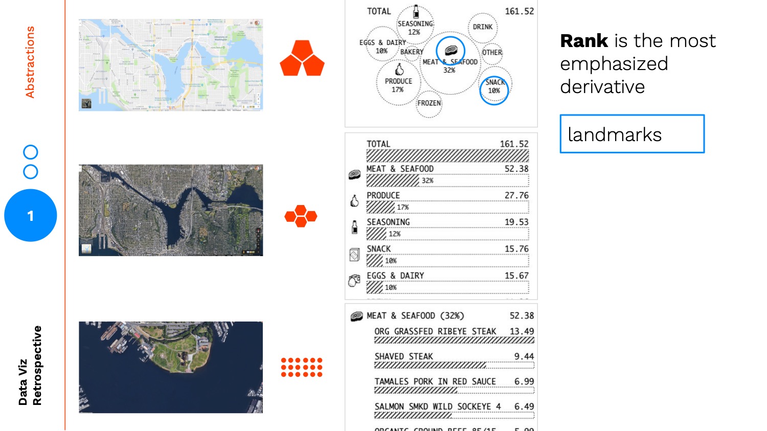
Earlier this year I worked on a side project where I redesigned a grocery receipt using data visualization. Let's use this project as an example of abstracting through fidelity.
Here's an image of the original receipt:
I started by adding in bar charts for each item relative to the most expensive item on the ticket: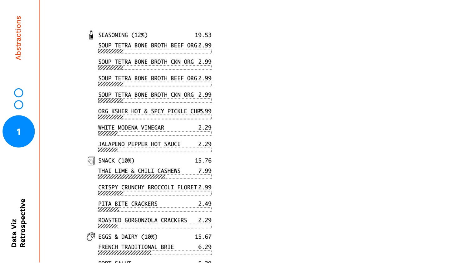
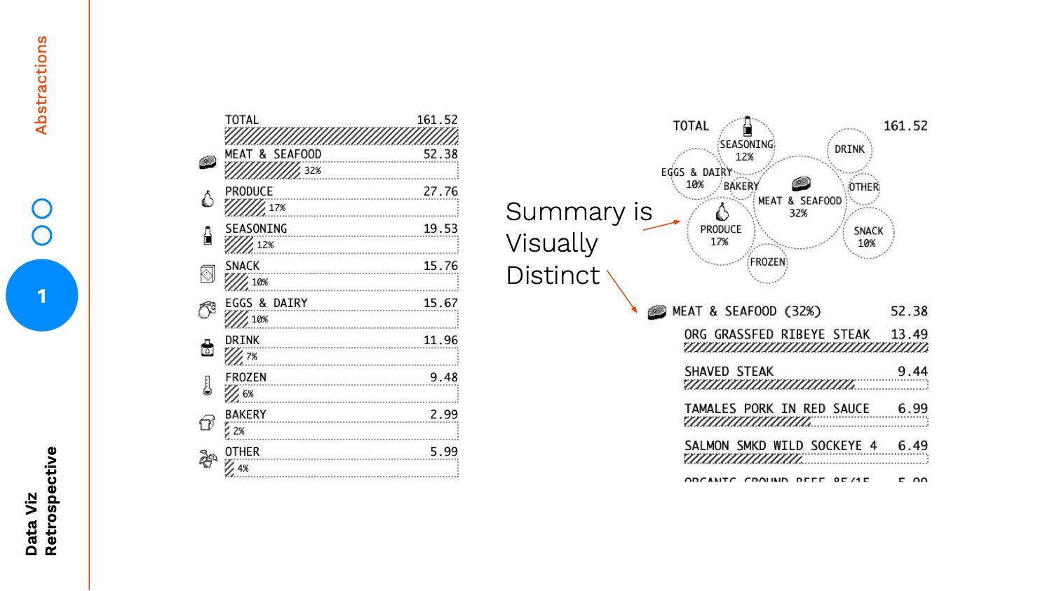
Here's my initial attempt at adding a level of abstraction by aggregating the cost by category:
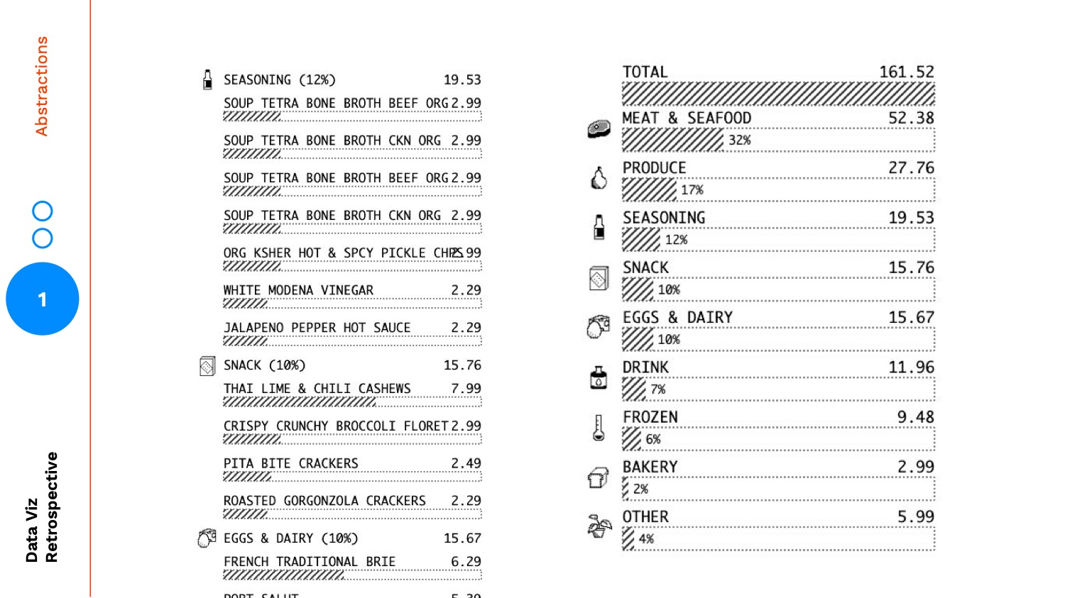
Instead of stopping there, I continued on to one more layer of visual abstraction, here is the final version:
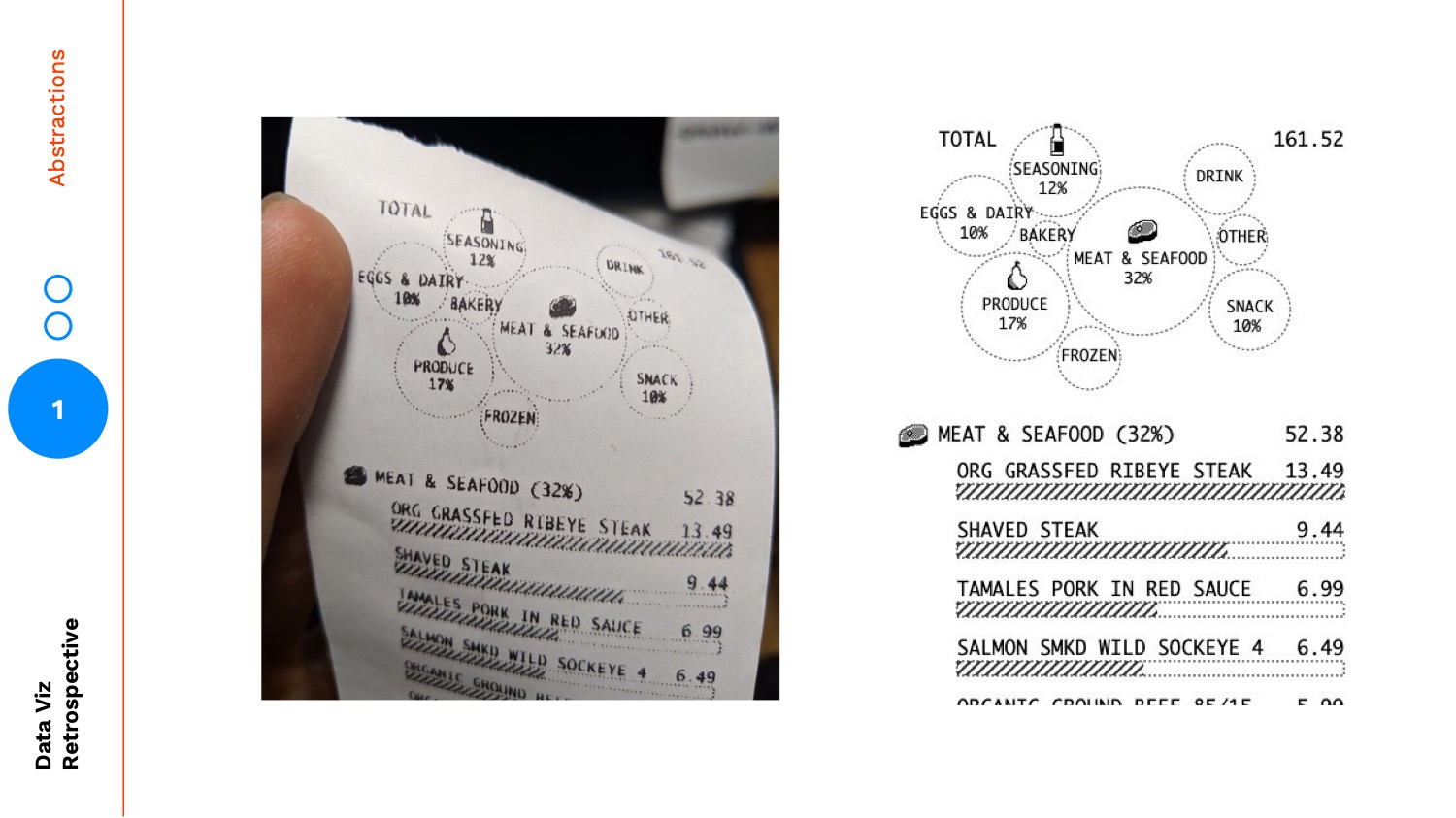
One of the reasons I changed from a summarized bar chart to a bubble chart, was to create a more visually distinct summary:
But the main reason was to emphasize rank and make the summary chart easily scannable. You might think initially that the bar chart on the left is a better summary of rank, but there are several encodings in the bar chart that are at odds from helping the user focus on rank. Each item has the same height, an icon, and the same labelling. Aside from the bar itself, you are giving each item equal visual weight and visual treatment.
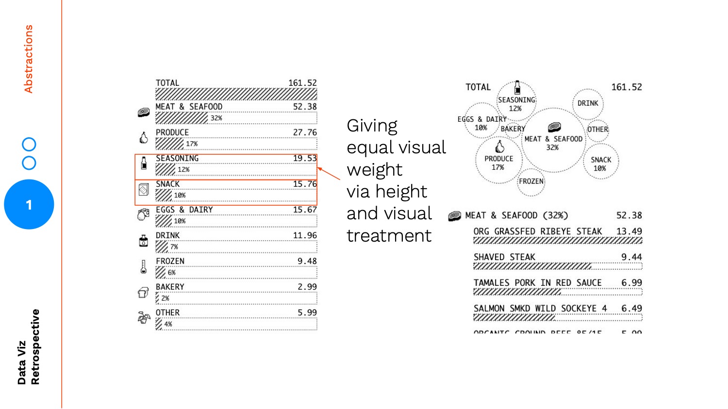
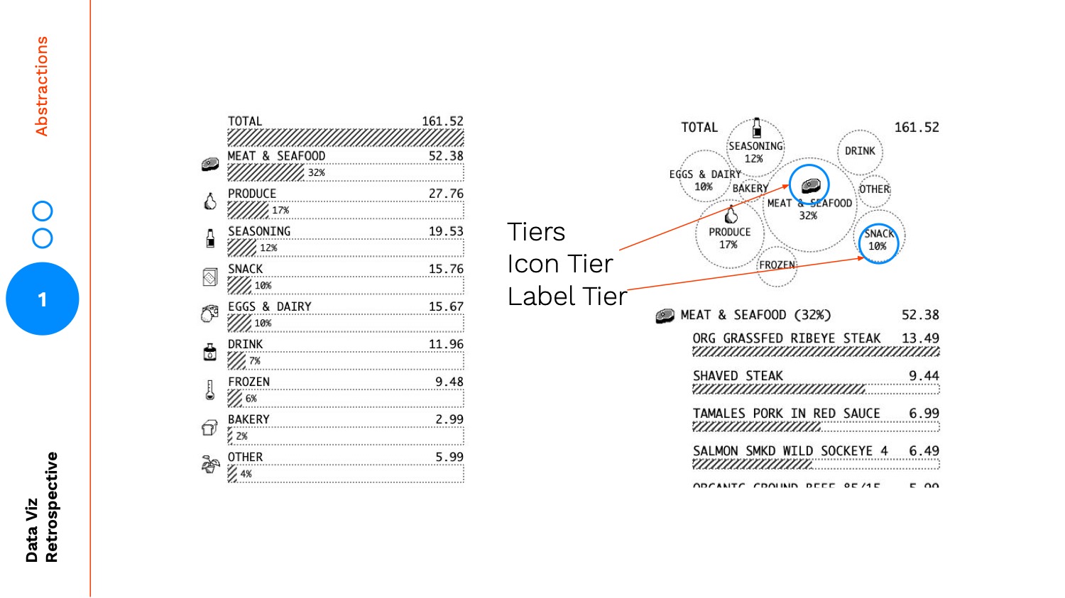
With the bubble chart you are using size to signal rank and then reenforcing it with a tiered hierarchy: the largest items have icons included, and the medium-to-large items have percentage labels. The tiered hierarchy layers on another level abstraction a grouping of big, medium, small.
The final bubble chart version is a less precise, higher abstraction than the bar chart summary:
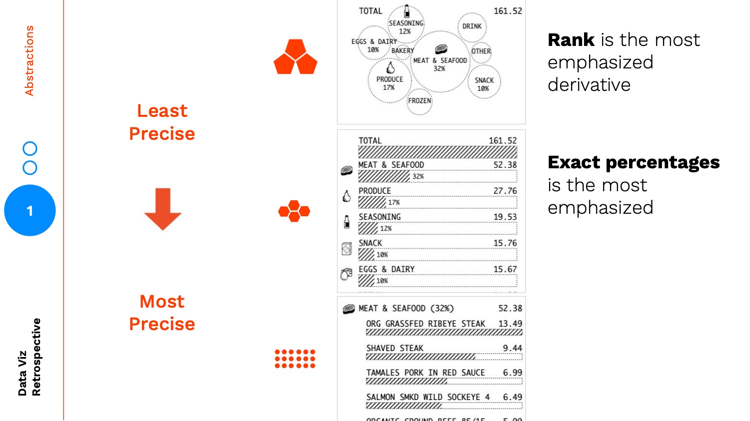
If we turn this into the map analogy, the zoomed in view is the individual items, the zoomed out view is the bar chart summary, and the non-satellite view is the bubble chart.
The icons and percentages are the landmarks that help bridge the reader from the higher abstraction back down.
This is necessary because:
Without the right landmarks:
It can be difficult to orient yourself and find a relationship down to the data points:
Conclusion
As we abstract higher and higher we are finding insights through patterns / themes and learning by separating concerns, conversely as we make our way down to the data points, we are understanding the precision and nuance in our data through learning by example.
When designing, you should be thinking about using multiple types of abstractions, across zoom, fidelity, and more.
Creating landmarks is how you enable your audience to successfully move through these layers of abstraction allowing for more meaningful insights. The more abstract, the farther you get from the data points, in turn, the more landmarks you should be creating to orient your users.
Thanks to this lovely crew of reviewers for my talk / post: Sam, Noah, Elijah, Ritchie, Blake, Jason, Rachel, Bao, Jian, Martin, Nova, Molly
This concludes part 1 of 3 from my Data Visualization Retrospective talk at Visfest 2019