d3.annotation: Design & Modes
4/20/2017
Last week I gave a talk at d3.bayarea(). Here's an adaptation of that talk as an introduction to d3.annotation().
Library Basics
I started this library by gathering examples of annotations that I liked. From those examples, the majority of use cases followed a pattern: a subject (the thing the annotation is annotating), a note, and a connector joining the note to the subject.
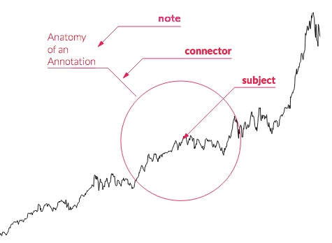
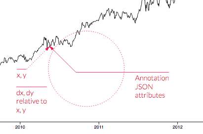
Each annotation is positioned with an x, y tuple which is where the subject is placed. The note is then placed as a offset from that x,y position and is set with the dx, dy properties.
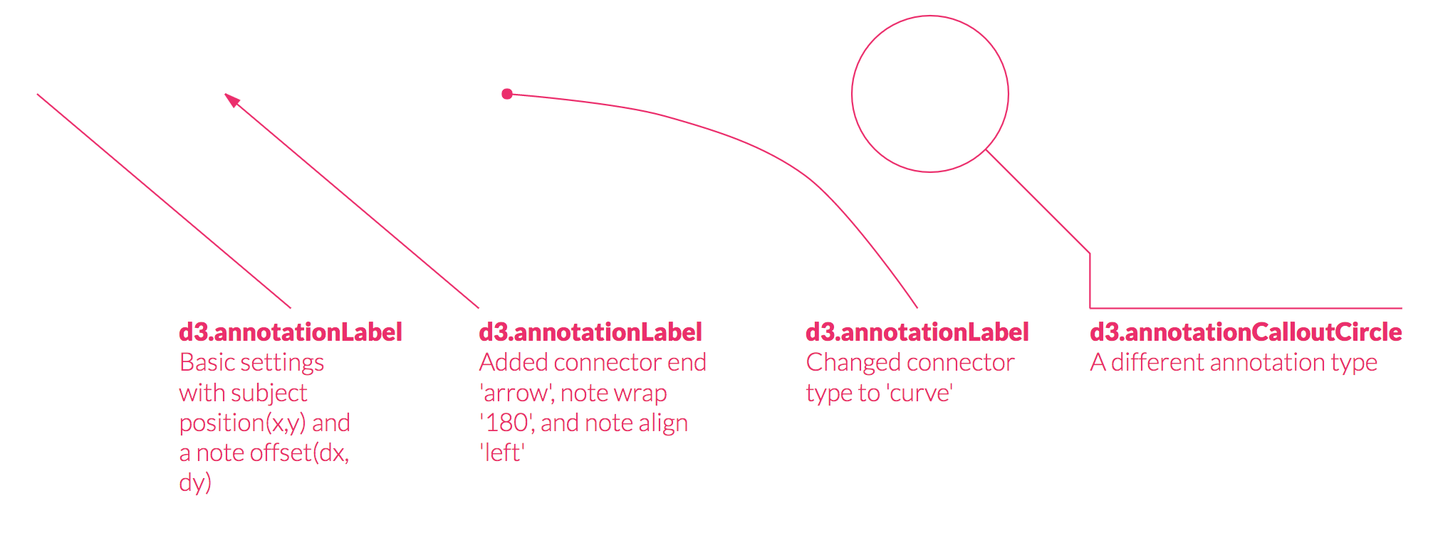
Below is an example of four annotations with a series of different settings to show parts of the d3.annotation() API.
Full Code: Basic Annotations without Scales
Annotations Today
In today's data visualizations, annotations are few and far between. When you do see them they are all styled the same and only discussed as part of the final product in a context-setting mode.
There are many more ways they could be used to better communicate with our audiences. In the following sections I discuss two topics Annotation Design and Annotation Modes to explore more uses for annotations.
Annotation Design
Thresholds and Annotation Color Styles
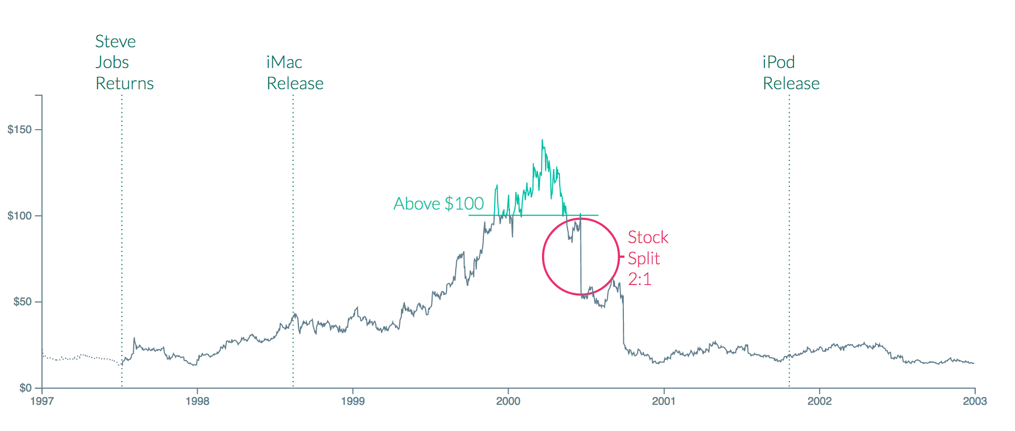
Let's take a look at the following example. This is the Apple stock price from 1997 to 2003.
Full Code: Thresholds and Annotation Color Styles
I've created three annotation styles, each with its own purpose:
- Historical dates: vertical annotations to mark important dates, low saturation makes them fade into the background
- High-price emphasis: to help the user see when the price is above $100, the annotation has a higher saturation to call attention to it. I've also emphasized this annotation by styling the line itself. This is done using a divided-line from Elijah Meek's Divided Line II block
- Anomalies: to explain the sudden drop in price (an anomaly in the dataset) as a result of the Apple stock splitting, I've used higher saturation and contrasting color from the rest of the chart to signal this is a special case
Points of Interest with Badges
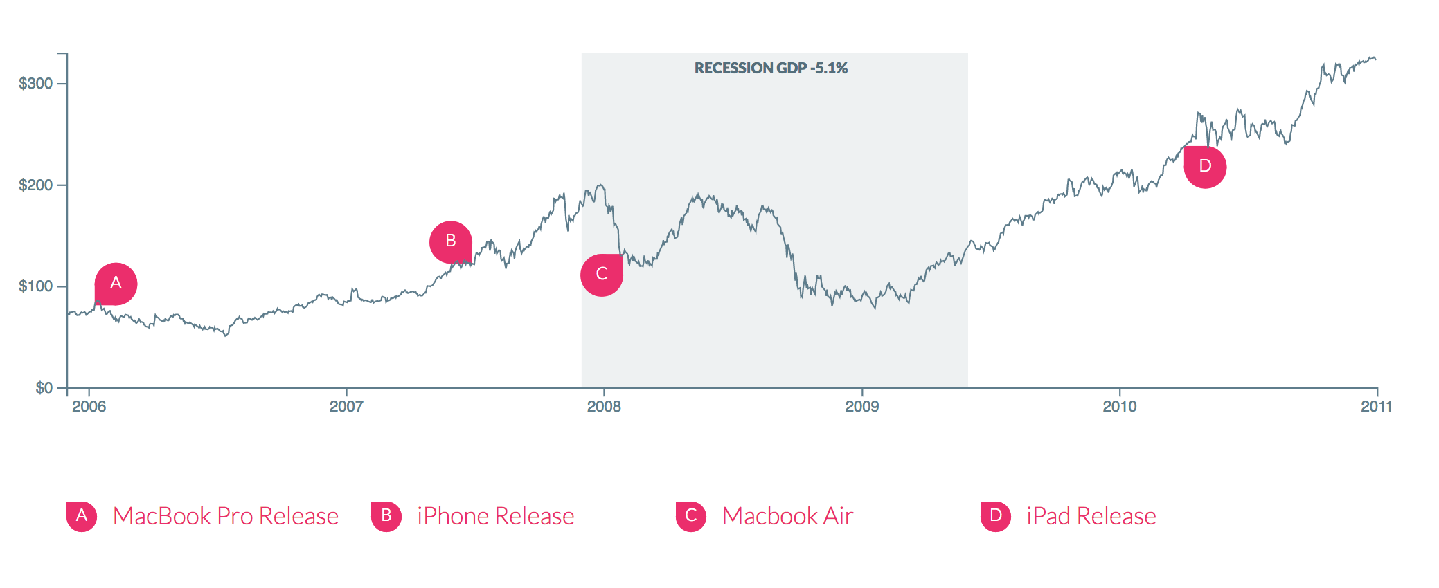
The next example is of the Apple stock price from 2006 to 2011. There was a series of new product releases over this time.
Full Code: Points of Interest with Badges
The span for the recession is made with a rectangular annotation with very subtle styling so it doesn't interfere with the line.
The badge annotations note the release dates. They could also be used as markers for comments by the author or audience. What other forms of symbology could we use as annotations?
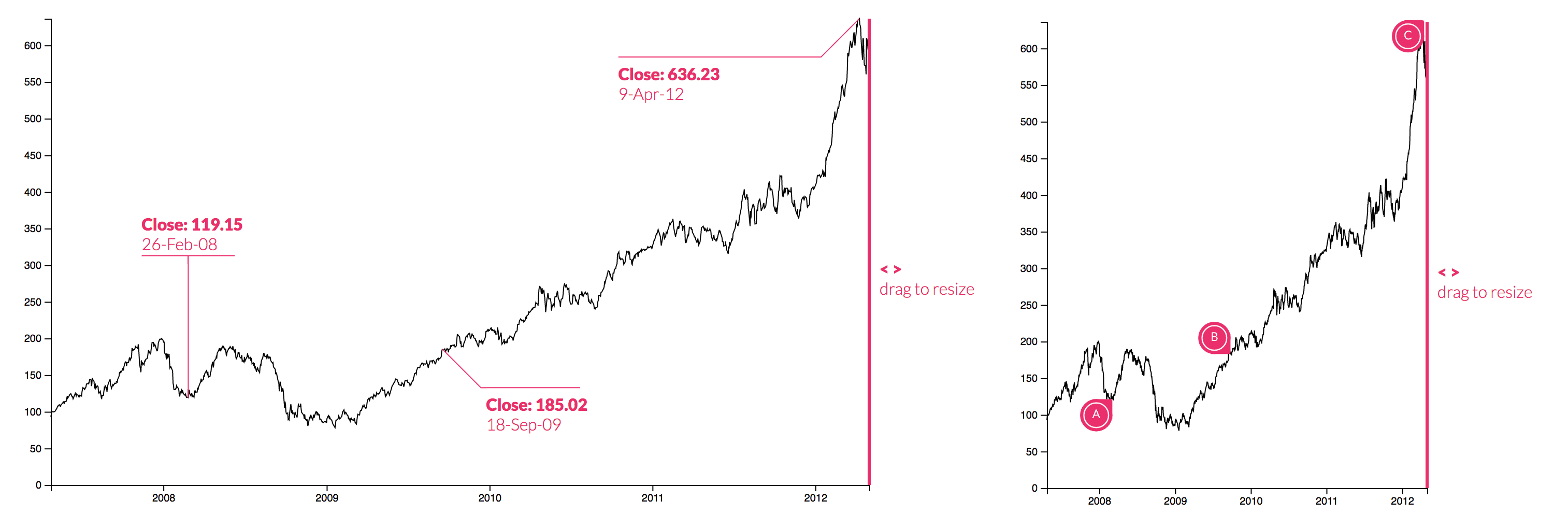
Responsive Visualizations
The badges from the previous example could also help with dynamically sized charts. When the visualization is full-width it would show a full annotation label but at a smaller size it switches to the badge which takes up less space but still signals that there is a note.
Full Code: Responsive Types and Hover
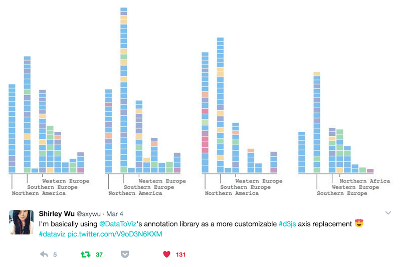
Annotations as Custom Axes
Here's an example from Shirley Wu that I found novel and exciting. She is using custom annotations as a replacement for axes.
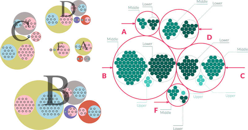
Annotation vs. Data Visualization
A side by side comparison of two circle packs. Same data, different mental models.
On the left the circle pack was created purely with graphical elements, just circles. On the right the inner circles are just circles the outer circles are annotations.
Making Annotations First-Class Citizens in Data Visualization by Elijah Meeks
Aren't the outer circles simply saying this is a group of things that are the same? What ways have we previously leaned on graphical elements in the past because annotations were not readily accessible?
Annotation Modes
Annotations are rarely discussed aside from a context-setting mode. Let's take a look at a few modes that are a shift from just context-setting, and a few modes that have not been discussed before, using annotations as part of your development process.
Diagrams
This is one mode of annotations that is often seen in scientific publications, using annotations as a form of explaining anatomies:
Schematics
Similar to a diagram, but actually using graphical symbols to simplify a system to its most essential pieces. The most extreme analogy here would be creating symbolic annotation types and the entire visualization itself would just be made with these symbol annotations.
Revision
Another mode we could use for giving critique is this revision mode. Think of markup from critiquing writing pieces:
What would this look like for data visualization? Could we come up with our own marks to critique each other's work?
Context-setting
An example I put together of using d3.anotation() in a context-setting mode.
I am working on a website where you could upload a photo and then add annotations. This would be a tool that could be used for any of the previous modes I've discussed.
Grouping, layout
This is from Nathan Yau's post One Dataset, Visualized 25 Ways. He states, "These are more sketches than they are finished graphics. There’s not much annotation, highlights, or explanations, and there isn’t any interaction."
At this point in a project, looking over the sketches and thinking about the final piece, you could enter this grouping, layout mode. For example, as part of the brainstorming process I could use annotations to circle all of the graphs that have severe dips:
Currently the graphs are just ordered alphabetically, how could I re-order them or change the layout entirely to discuss them together?
The final version doesn't need annotations. I could just show the charts with large dips and dig further into their stories, but by brainstorming groups to annotate together, it highlights the important pieces in the story and how they should be spatially located.
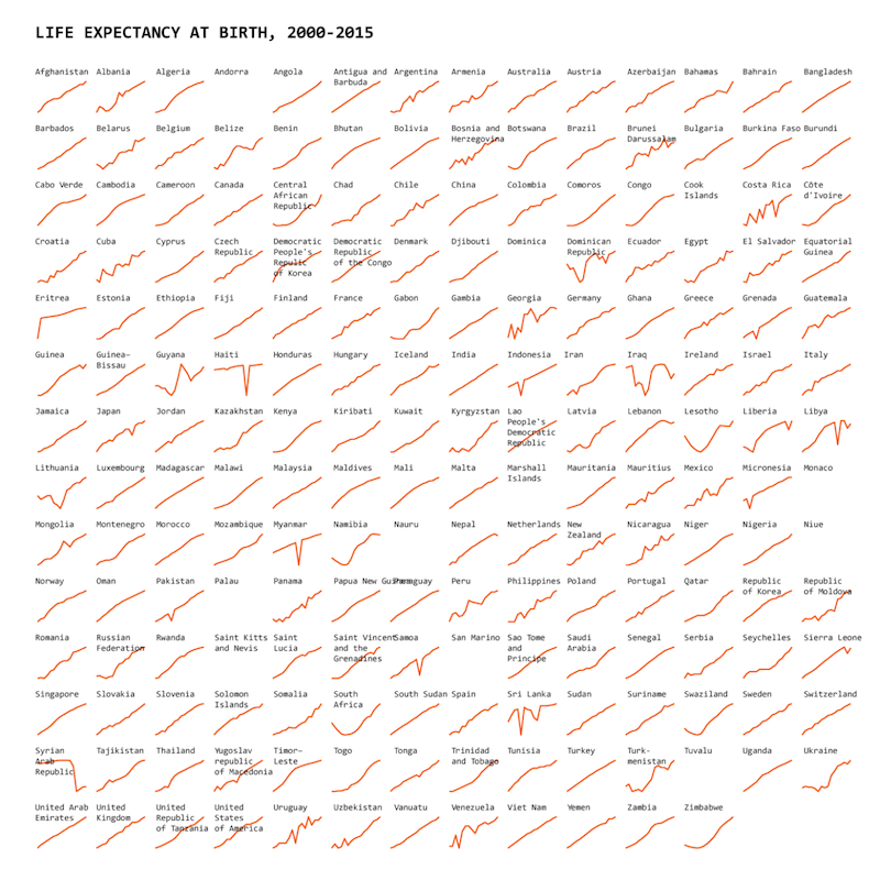
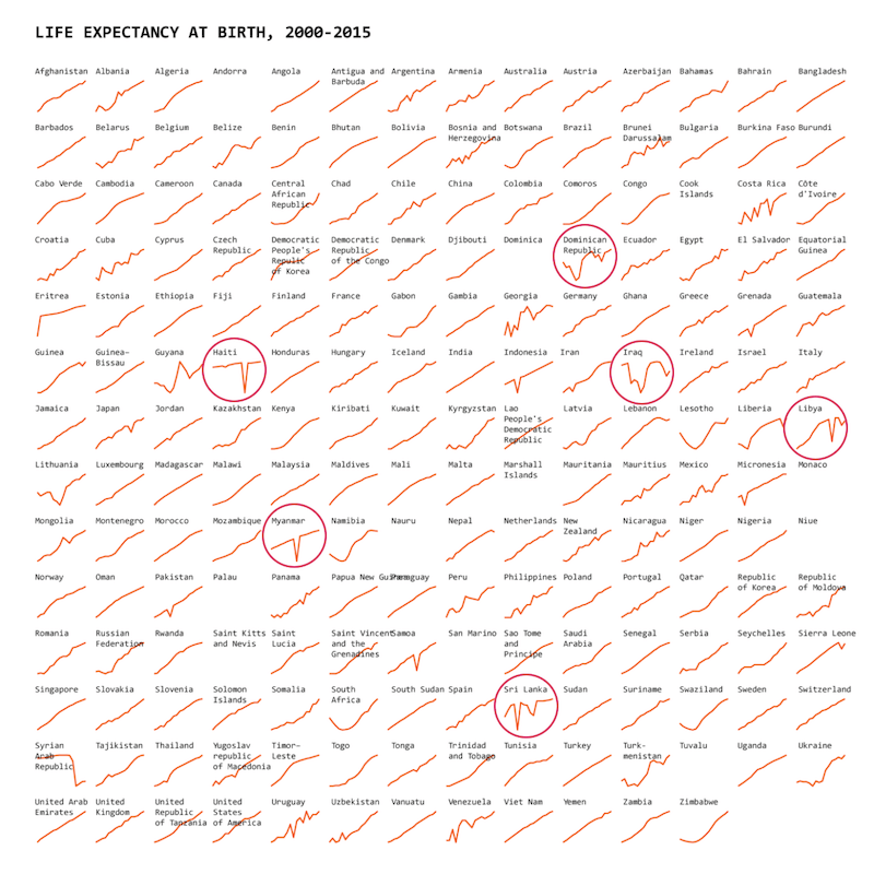
Story-finding
As I've been using annotations more and more, I've started integrating them into my design process. When I'm exploring a dataset I've found it helpful to add annotations to clarify context as I'm developing.
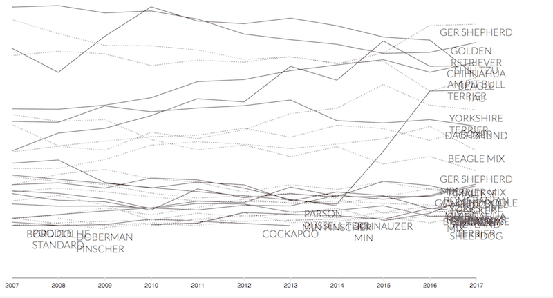
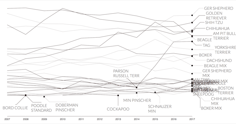
Here I am exploring a dataset around dog breeds over time. I've created this line chart to understand trends in the data. I added labels for clarity but they're all overlapping:

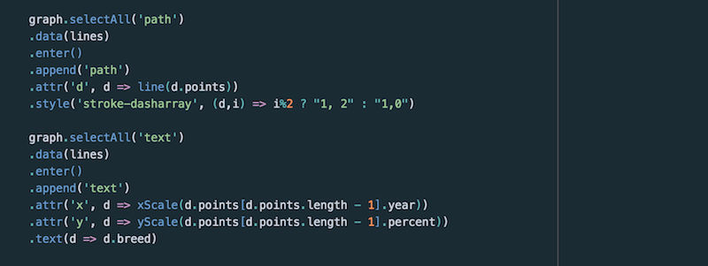
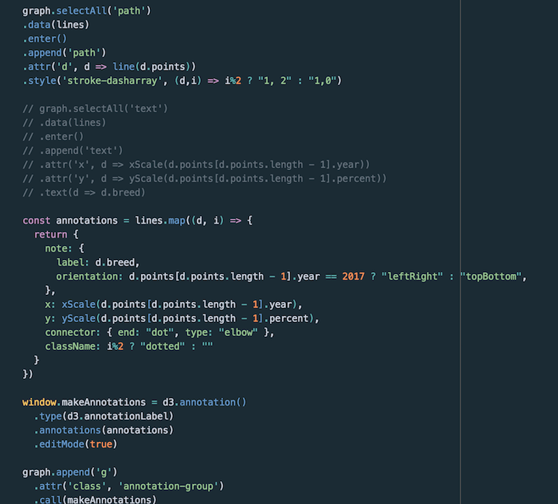
The code to create the lines and the labels:
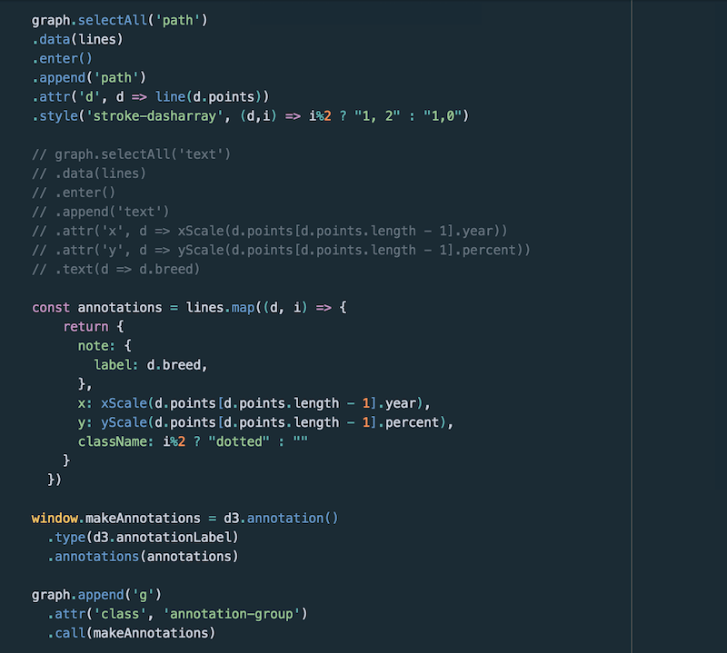
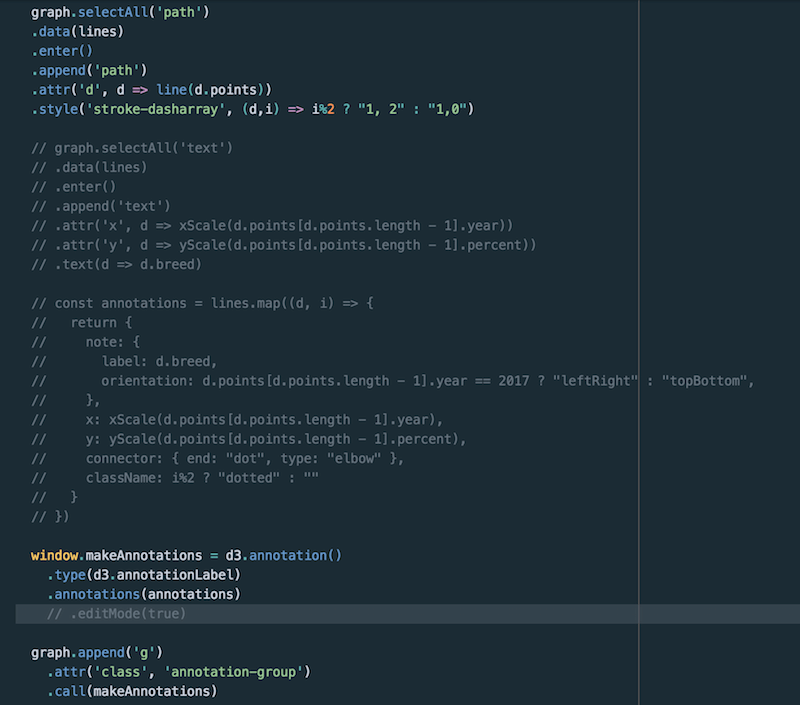
Changing the code so the labels are now annotations:
The resulting image with annotations as labels:
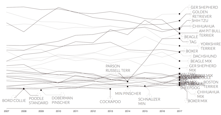
Now adding a couple of label display settings and turning .editMode(true):
Findings emerge just from being able to drag the labels around, such as:
- The Shih Zhu actually overcame Chihuahua in 2017
- The Cockapoo drops out of top 30 in 2013
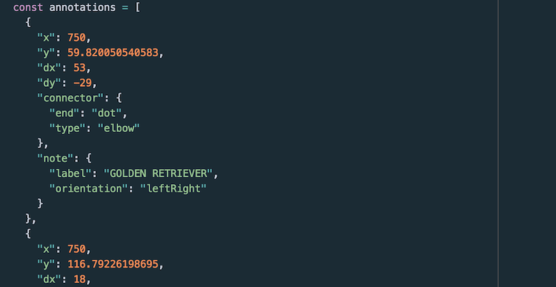
After dragging the labels around, I can go into the console and run the makeAnnotations.json() to copy the new label positions to my clipboard. I can also call makeAnnotations.editMode(false) to turn it off and see how the labels look without the drag handles in the way.
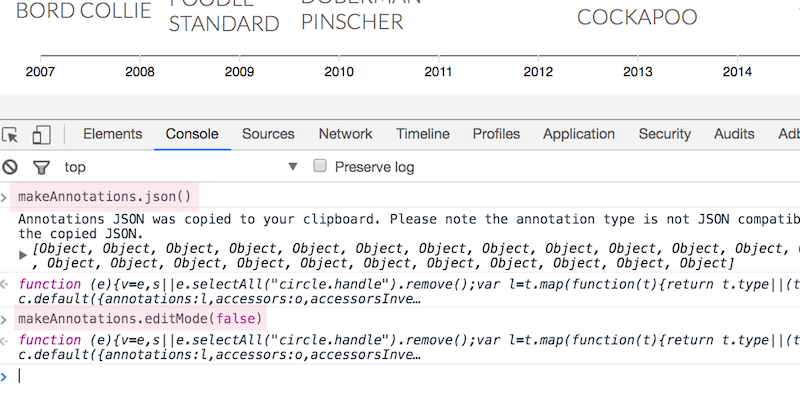
I can paste the full json of label positions into my file as a snapshot point and remove the original code that generated the positions. On refresh the labels will be in the exact same place I dragged them to.
In Summary
The goal of d3.annotation() was to make using annotations easier for our community. My hope is that it results in more examples of using them in innovative, and creative ways.
I would love to hear your thoughts about annotations and their roles in data visualization, reach out on Twitter.