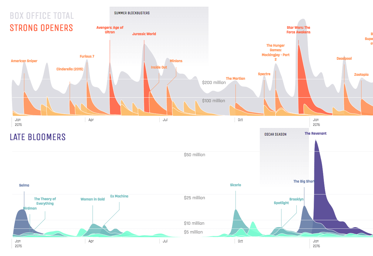
Strong Openers and Late Bloomers
BOX OFFICE TRENDS 2015 - AUG 2017
A full interactive version is here. This project is a remake of the New York Times The Ebb and Flow of Movies: Box Office Receipts 1986 — 2008.
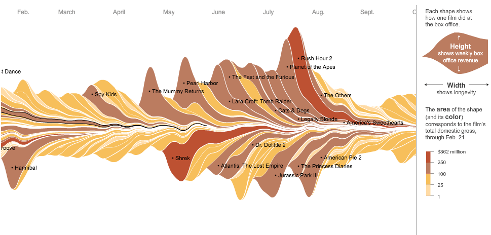
New York Times: The Ebb and Flow of Movies
The original chart had quite the aesthetic appeal and unique visual design. For this remake, I limited myself to use the same:
- Data in the original chart, except from 2015 - 2017
- Goals, contrast summer blockbusters with Oscar contenders
Iterations
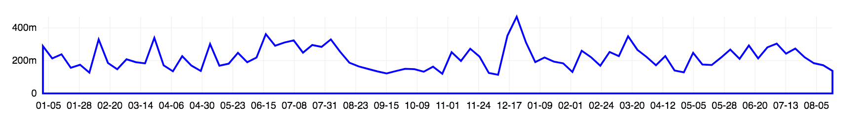
I started by looking at the total box office receipts over time. I wanted to use this as a baseline for comparison.
Since the original chart stacked all of the movies together, it was difficult to read the peaks and valleys by title. The next step was to plot each movie over time and understand if there were contrasting visual patterns between Blockbusters and Oscar contenders.
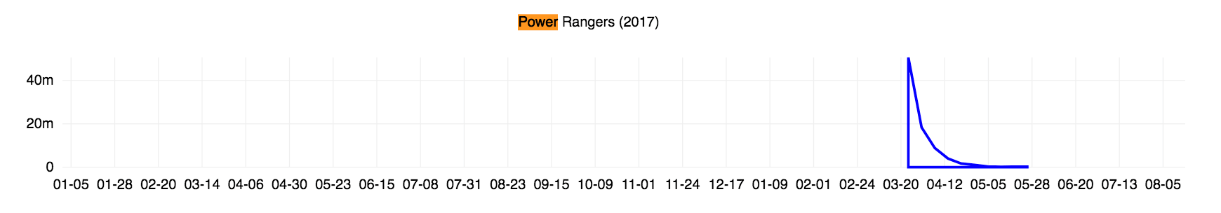
Power Rangers
La La Land
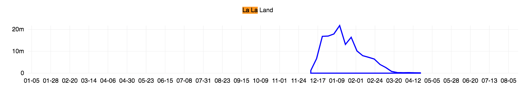
In the example above, seeing the gradual rise of La La Land in comparison to Power Rangers' sharp decline after opening weekly was on of the many cases that showed Blockbusters, Strong Openers, did indeed have a different pattern from Oscar contenders, Late Bloomers.
I had success with some simple logic for programmatically determining Strong Openers from the Late Bloomers: if the maximum weekly receipt was in the first or second week categorize it as a Strong Opener, otherwise categorize it as a Late Bloomer.
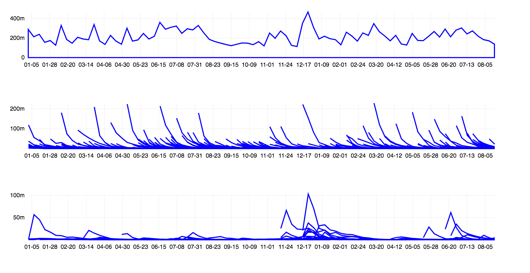
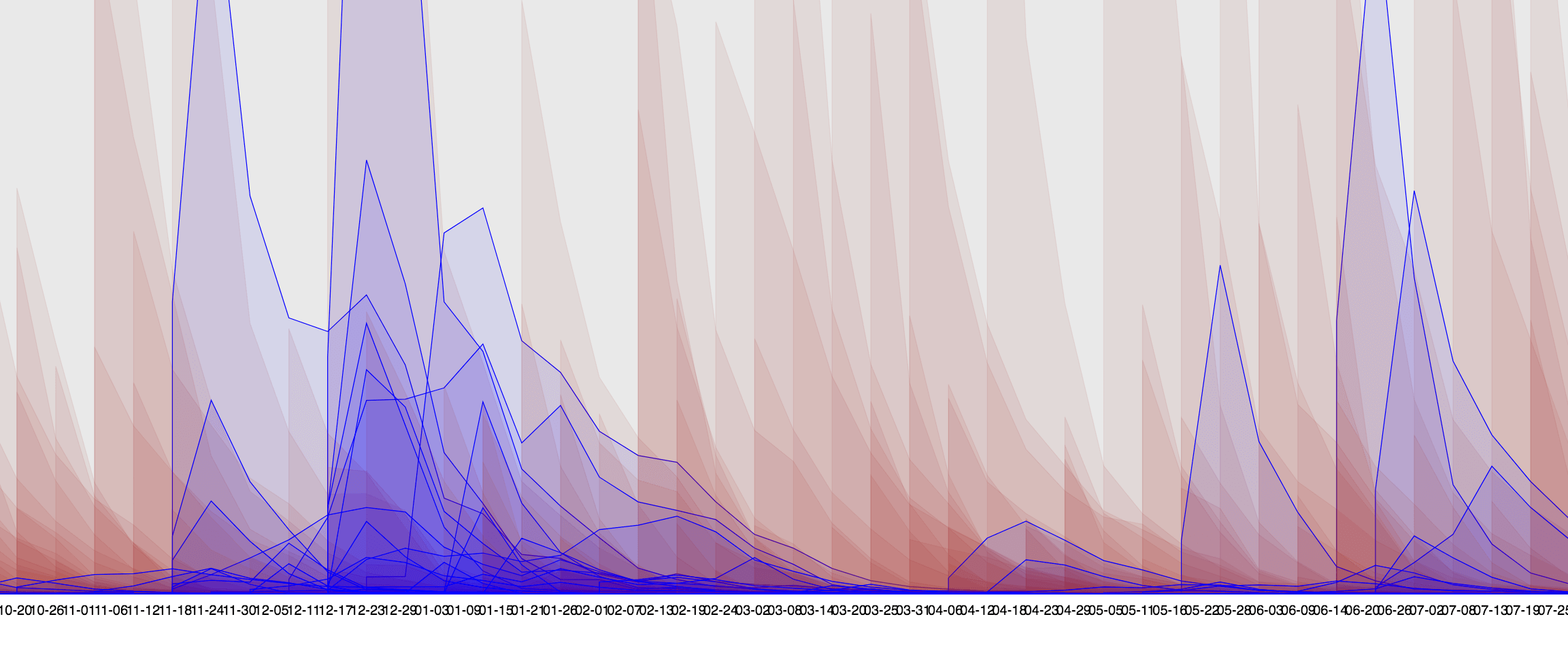
Then I moved on to brainstorming the final layout of the piece. I tried a few configurations attempting to put all of the title curves on the same chart, but it became too noisy and overwhelming.
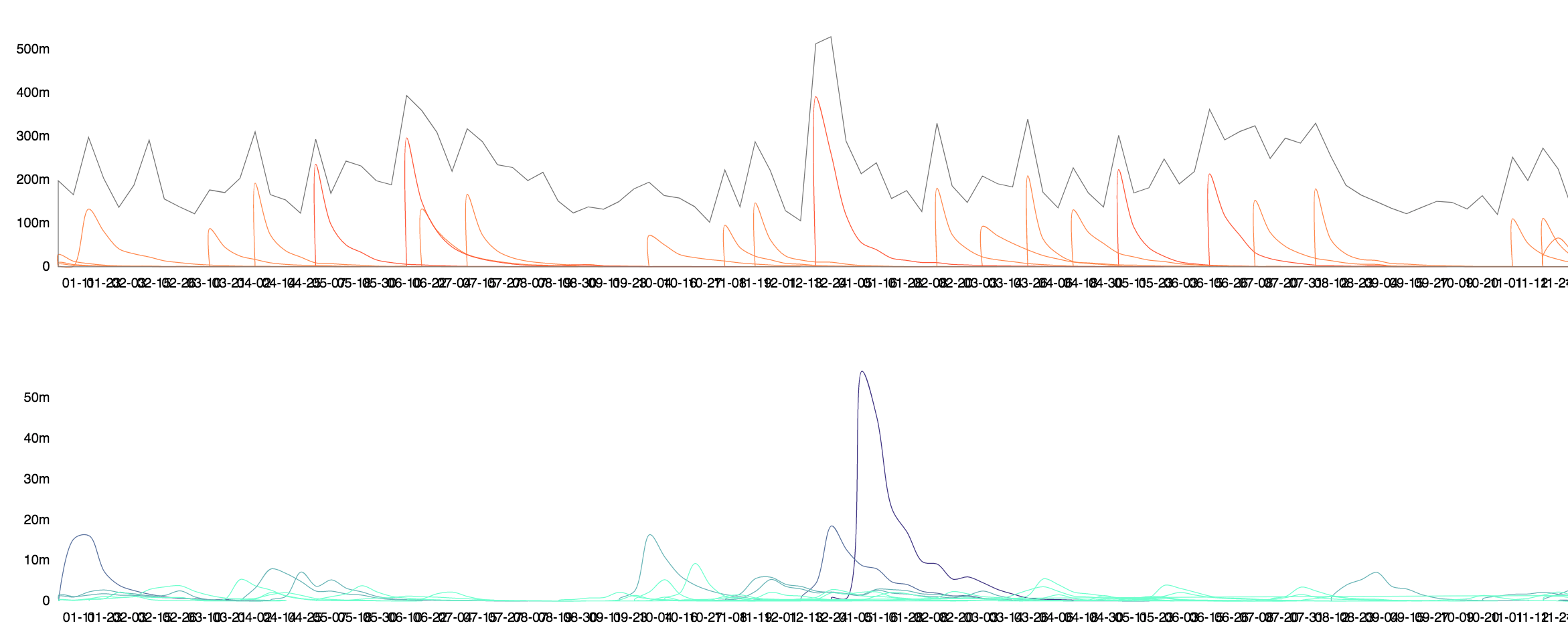
I decided to split them out into two. The Strong Openers would be overlaid on the total box office numbers because they heavily influenced the overall numbers. The Late Bloomers were pulled out into their own chart since the scale of these movies was much smaller and I wanted to highlight their unique trends prominently.
Design Elements
In the final version I added these design elements in to make it easier for viewers to explore the patterns:
- Filtered down the titles to the top movies based on rank over the last 2.5 years.
- Annotations for the top titles, and relevant movie seasons: summer blockbusters and oscar season
- Minimal axes to avoid clutter, and duplication of axes labels due to the width of the charts
- Two clear color palettes to differentiate Strong Openers from Late Bloomers
- Clear hover coloring and tooltips for more detailed data
I liked being able to click on a title to read a synopsis, and find titles via search in the original design. I would have liked to add those features but kept it out of the scope due to time constraints.
Acknowledgements
Thanks Noah for brainstorming, and Elijah and Sam for reviewing.
The data for this remake was from Box Office Mojo.
Made with Semiotic and Create React App.
I also enjoyed using chroma.js for making the color scales used in the visualization.